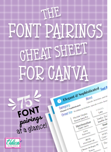
The Font Pairings Cheat Sheet for Canva
Ever been lost in a sea of fonts, wondering which two would look amazing side-by-side on your design project? Well, the ‘Canva Font Pairings Cheat Sheet’ is here to save your day! This article aims to make font pairing in Canva a breeze for designers like you.

Introduction to Canva Font Pairings
Ah, font pairing – the unsung hero of design! We’ve all been there: a design that looks “off” even when everything seems to be in place. Often, the culprit is mismatched fonts. But why is font pairing so crucial?
Why Font Pairing Matters
Imagine a formal corporate report written in Comic Sans:

Doesn’t sit right, does it? Font pairings can evoke emotions, set a mood, and even communicate a brand’s personality. Just like the rhythm in music or flavors in cooking, the right font combination can create harmony in design.
This would be a better bet …

Challenges of Choosing Fonts
However, not all fonts play nice together. Some might overshadow others or compete for attention. Picking the right duo can be like matchmaking; it requires a keen eye and a bit of experimentation.
Navigating Canva’s Font Options
With Canva’s vast font library, how does one even start? Good news: you don’t have to sample them all. We’ve got you covered with the cheat sheet below.
Overview of Canva’s Font Library
Canva is a gold mine for fonts. From classic serifs to whimsical scripts, Canva boasts a range of styles to cater to any project.
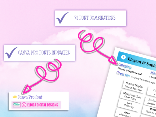
Free vs. Canva Pro Fonts
Most of the 75 font combinations in the cheat sheet are accessible to everyone. However, a select few are exclusive to Canva Pro users. Wondering if the upgrade is worth it? Read on!
Top 5 Font Pairings in Canva
Let’s dive into some stellar combinations:
Classic Combinations
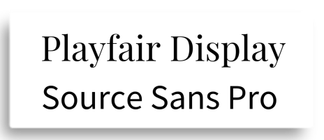
- Playfair Display & Source Sans Pro – A blend of vintage and modern, perfect for sophisticated designs:
- Lora & Raleway – A versatile duo for any professional presentation:

Modern Mixes
- Cinzel & Lato – Sleek, clean lines that scream contemporary:

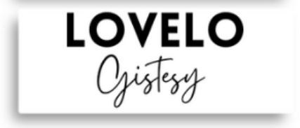
- Lovelo & Gistesy – Bold headers coupled with crisp body text:
Funky & Fresh Pairings
- Pacifico & Arial – For when you want a splash of fun in your design!

Tips for Effective Font Pairing
- Maintain hierarchy: Let one font dominate and the other support.
- Contrast is key: Mix different styles, but ensure they complement each other.
- Don’t overdo it: Two’s company, three (or more) might just be a crowd.
Elevating Your Designs with Canva Pro
With Canva Pro, you unlock a plethora of premium fonts. Besides, you get access to other features that elevate your designs. Is it essential? No. But it sure can be the cherry on top!
Conclusion: The Power of Proper Font Pairing
In design, every element counts. The right font pairing can be the difference between a forgettable design and a memorable one. So, next time you’re scrolling through fonts on Canva, remember: the perfect match might just be on our cheat sheet!
FAQs:
- Do I need to be a design expert to use the font pairing cheat sheet?
- No, the cheat sheet is designed for both novices and experts.
- How many fonts does Canva offer in total?
- Canva has a library of thousands of fonts, constantly expanding with new additions.
- Are all font pairings suitable for every project?
- While the cheat sheet provides versatile combinations, the context and purpose of the project should guide your choice.
- How can I access fonts exclusive to Canva Pro?
- Upgrade to Canva Pro to unlock all premium fonts and features.
- Does font pairing impact the readability of my project?
- Yes, proper font pairing ensures both aesthetics and readability, making your content stand out and easy to read.
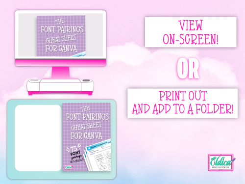
Grab a copy of the Canva Font Pairings Cheat Sheet by clicking on any of the images below!
See you next time!

- UNLOCKING THE POWER OF SVGs: Understanding their importance in the DIY crafting world
- MASTERING SVG DESIGN: The top software and programs for professional results
- DESIGN LIKE A PRO WITH INKSCAPE: Step-by-step instructions for downloading and installing
- THE ULTIMATE BEGINNER’S GUIDE TO INKSCAPE: Learn how to create stunning vector graphics
- MASTERING THE ART OF INKSCAPE: How to align your canvas with your Cricut mat for perfect cut-outs
- MAXIMIZING YOUR DESIGN POTENTIAL WITH THE INKSCAPE TOOLBOX BAR
- DESIGNING A HEART SVG IN INKSCAPE: A step-by-step guide
- DESIGNING WITH INKSCAPE: How to create stunning text SVGs
- SVG TROUBLESHOOTING 101: How to open files displaying as web icons
- INKSCAPE PATH OPERATIONS: The Ultimate Guide for Vector Design Beginners
Join the Eldica Digital Designs Mailing List and Get Exclusive Offers!
Members get access to exclusive offers and sales!